Seqster
Brand strategy + visual refresh + website design.

establishing a new brand category
Seqster had the audacity to break down data silos — empowering people to seamlessly retrieve, harmonize and even share personal health information from multiple sources. They came to us seeking strategic guidance to help articulate their mission and empower Seqster’s cutting-edge essence visually. Describing what they do and the value they offer to the various stakeholders was paramount. Audacity helped craft their story to establish the presence of this new innovative health data management platform.
analytics
strategy
creative
the person-centric approach
During a series of in-person strategic workshops, the Audacity team worked closely with Seqster’s leadership to hone-in on three core attributes. Convenience. Trust. And Empowerment. Next, we zeroed in on what matters most to them — people. And from there the Audacity team crafted every headline, tagline, typographical character, color and icon to unequivocally embrace this essence in their communications
digital
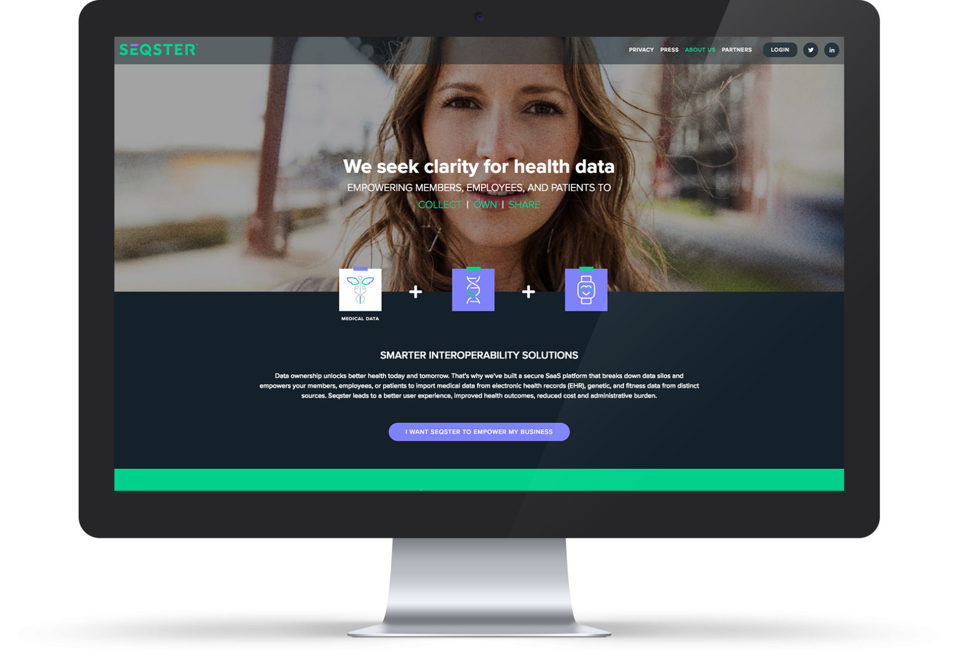
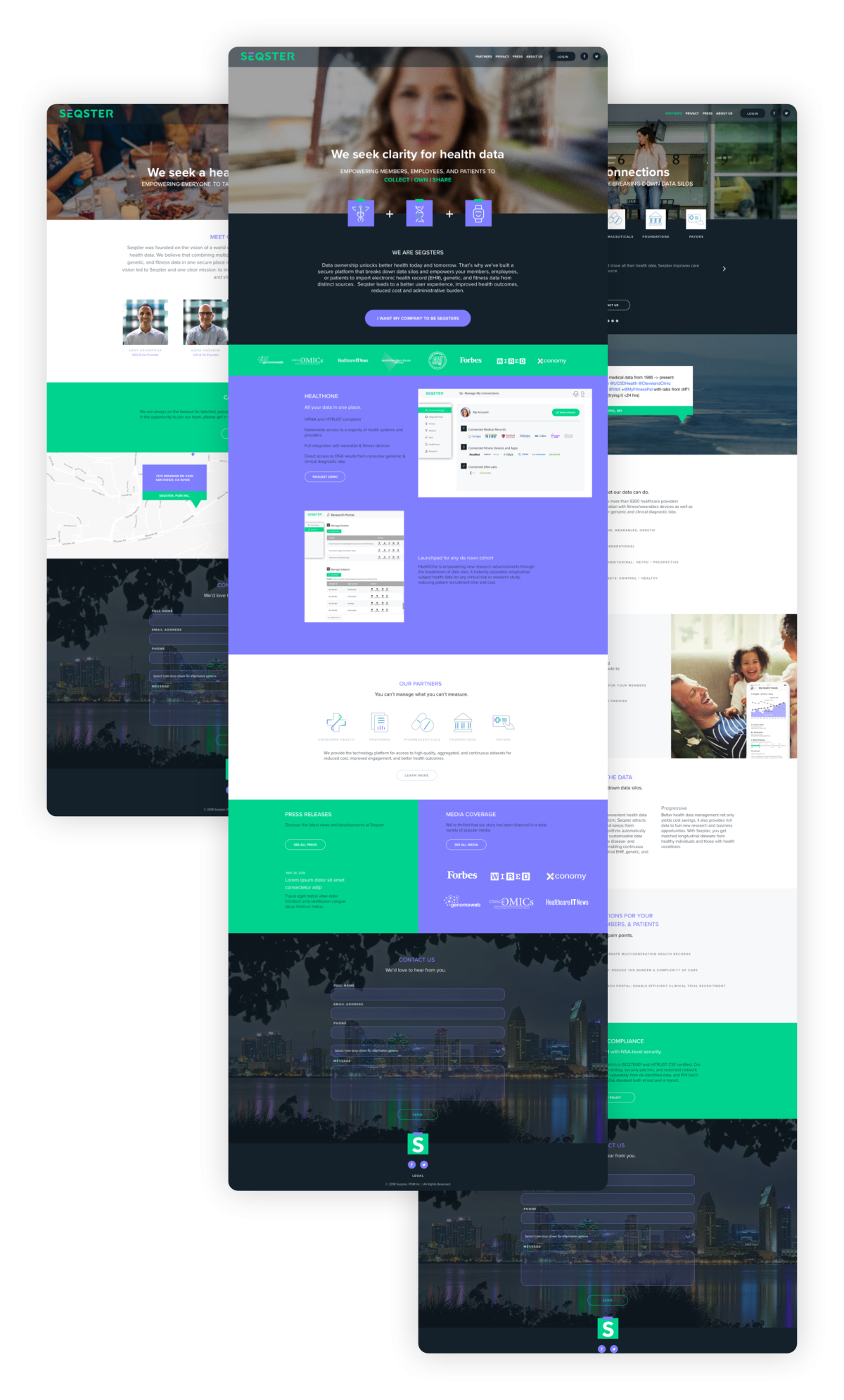
The website elegantly communicates the Seqster story while showcasing their innovative technology and value.
Designed to reflect their high tech, high value offering, the platform’s ease of use and intuitive user interface are featured with dynamic imagery. Icons easily map the value to each stakeholder and clarify how Seqster’s person-centric approach will improve health data management for all.
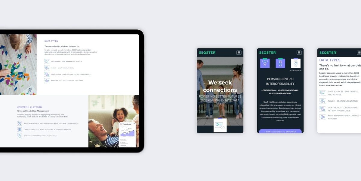
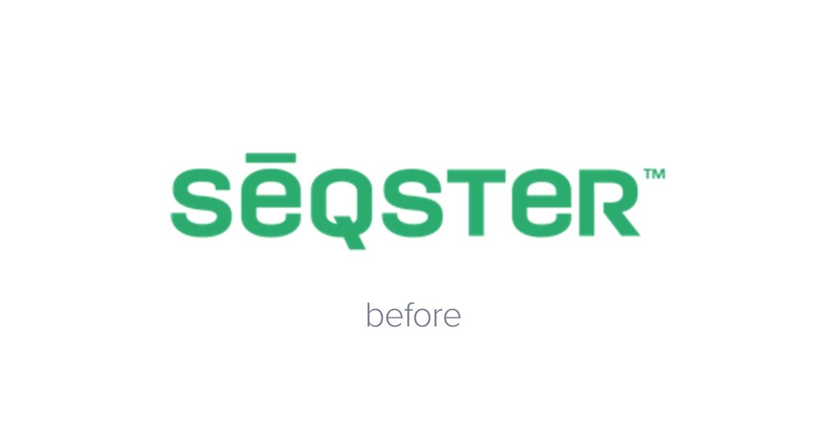
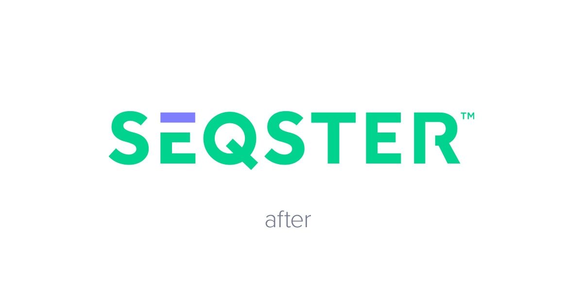
The wordmark was updated to be a bit more modern — creating a letterform that was not too male, not too female and not too serious. It was designed to be more geometric and consistent in thickness to keep the letterform personable, simple and fun. For iconography, we’ve created both a primary and secondary style — allowing us to distinguish dominant content vs supporting.
